Control panel interface description
Supported browsers
Working with ispmanager interface is supported in the following browsers:
| Browser | Minimal version |
|---|---|
| Mozilla Firefox | 70 |
| Google Chrome | 60 |
| Microsoft Edge | 80 |
| Safari | 12 |
| Opera | 47 |
| Yandex.Browser | 17.9 |
Authorization
Enter a username and password to log in to the control panel.
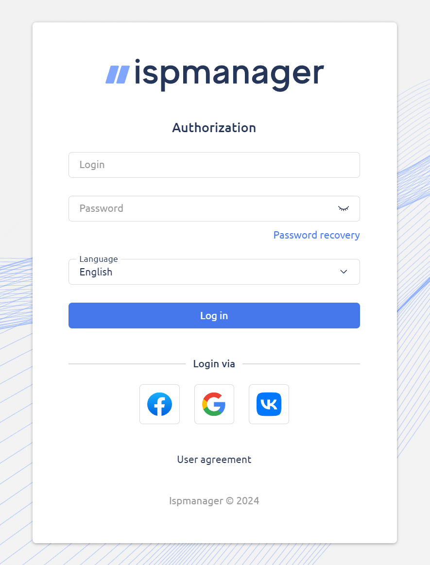
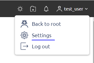
In User settings (right upper corner of the interface) you can select the language that will be used in web interface, change password, enable 2MFA, etc.
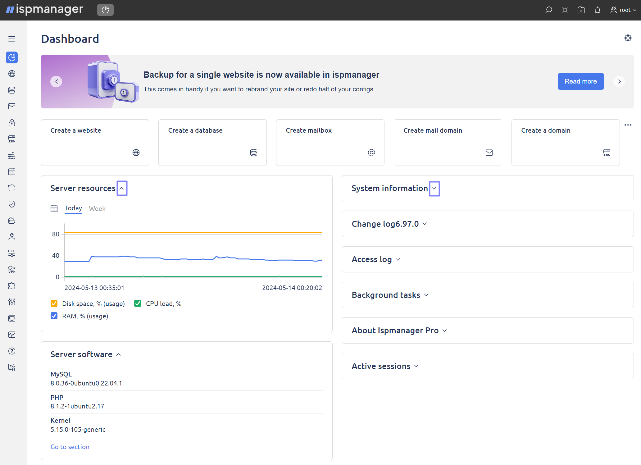
Dashboard
Dashboard is the main page of the control panel and is the page users see first upon logged in.
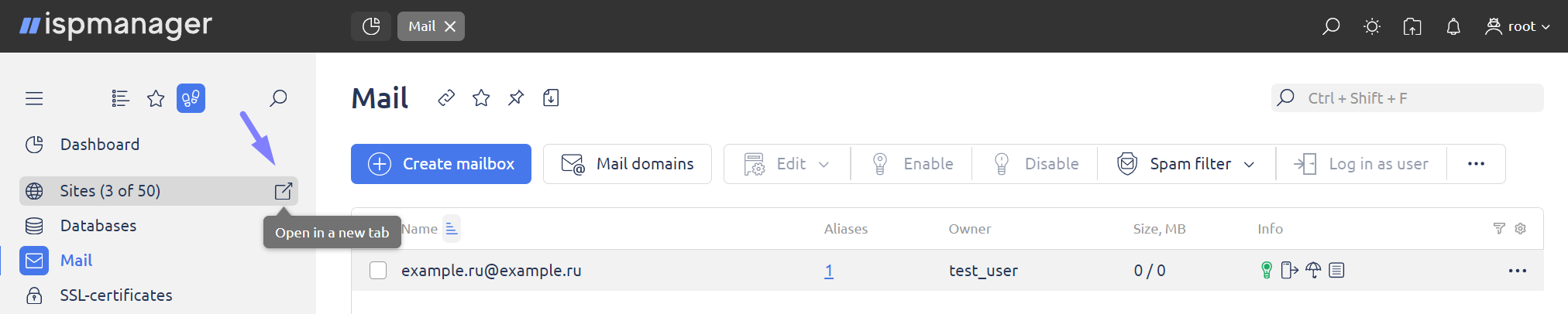
The page contains Task bar with buttons and links to the main sections of the control panel. Blocks and buttons show various Information (such as a number of users, sites, traffic usage, etc.). Information can be presented in the form of graphs and charts and can be closed, removed or updated.
Dashboard blocks management
The Dashboard page gives you the flexibility to customize the arrangement of elements to suit your personal preferences.
To move the dashboard block to the desired location, move the cursor over the six-dot icon. When the cursor changes to a drag icon, drag the dashboard to the desired location on the screen.
The dashboard bar is now in a convenient location, giving you easy access to important items and information. This ability to move provides a more personalized dashboard experience.
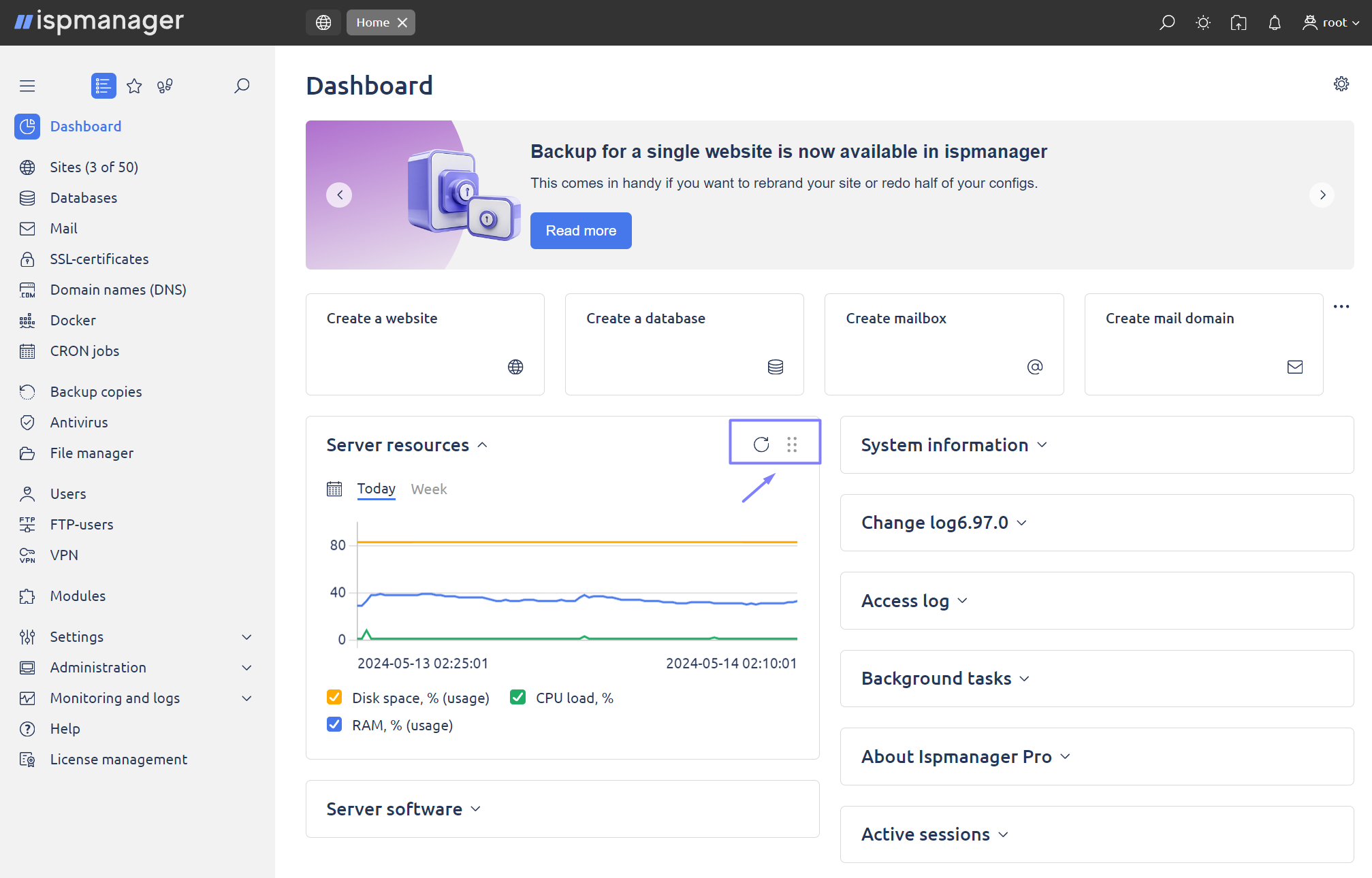
Navigation menu
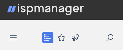
To quickly navigate to the control panel sections, use the navigation menu, which is located to the left of the main table. It is a list of the control panel sections available to the user.
The menu has different states: Expand/Collapse menu, Main menu, Favorites, and Popular. The following switch buttons are available at the top of the menu.
- Expand/Collapse menu — use the button to hide the main menu to the left side of the screen;
- Main menu — the full list of items available to the user;
- Favorites — items you have added to your favorites list;
- Popular — the most used items;
- Search — use menu search to quickly navigate through the items. Just type the first few characters of the item name to see it in the list.
Main table (list of elements)
To perform an operation in the table, select one or multiple raws, and click the corresponding button on the toolbar. To select a group of elements, you can use the following buttons:
Ctrl — select a number of raws.
Shift —  to select a group of elements, click the first item, press and hold down the Shift key, and then click the last item.
Many buttons on the panel may be inactive. This means that the action does not apply to that item. After the items in the table are selected, the buttons become active. Under certain circumstances, buttons may remain inactive. In some cases, you can read the reasons in the tooltip of the button.
In the User settings module, you can change the number of rows displayed per page. This will help you work with tables containing too many raws.
Clicking the names of the raws will sort data in the table. Information can be sorted out by one or multiple columns.
At the bottom of the table, you can see statistical information about the table's elements. If no raws are selected, information is displayed for all the raws, otherwise — only for the selected elements.
Active buttons
|

| This is a tool that allows you to quickly find information within the different sections of the panel. Simply enter keywords or phrases in the search field and the system will return relevant results from different sections. This greatly simplifies access to the required data and increases the efficiency of working with the panel. |
|

| Selecting panel theme. The panel offers several theme options to customize its view.
|
|

| This is a tool that allows you to upload files and documents directly to the panel. It is a convenient way to import information and materials for further work. |
|

| The panel provides a notification feature that allows you to receive important messages and alerts. You can customize your notifications by choosing which events and messages to receive and which to ignore. This helps you stay on top of current events and changes. |
|
| The button for personal user settings gives you control over your personal profile and preferences. Here you can customize your profile, change your password, set the interface language, and more. You can also use this section to log out of the panel when you need to end your session. This ensures that your account in the panel is secure and manageable. |
Tabs
You can open multiple tabs at the same time, switch between them easily, and close the modules you don't need anymore.

Use the following hotkeys:
CTRL + ALT + X — close all tabs

CTRL + SHIFT + X — close all tabs but the active one
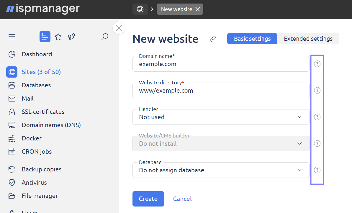
Form
A form is used for performing a number of operations in the control panel, and may contain the following types of fields:
- text field;
- drop-down list;
- password input field;
- check box;
- radio-buttons (select-one-option buttons);
- slider.
|

| If a text field requires multiple values to be entered, an icon appears next to the text field that, when clicked, expands the text field so that entries can be made line by line. |
|

| Text fields that require numeric input have an additional control that allows you to set a value that is analogous to no constraint. |
|

| Each field contains a sample information entry, highlighted in gray. If the information is correct, an icon appears next to the field. If it is incorrect, a message appears with a description of the error and the correct input format. |
|

| In the Password field you can enter the password manually or generate it automatically using the button. |


| You can also show or hide the password you enter. |
|

| When a feature is active, it means that it is currently running and available for use. Users can use the functionality without any restrictions. |
|

| The function is temporarily disabled. When a function is temporarily disabled, it means that the function is temporarily unavailable for use. |
|

| This symbol serves as an important indicator that draws the user's attention to a particular item, message, or event. It indicates that there is something worth paying attention to and can be used to highlight important information or make you aware of something important. |
|

| All fields in the interface have handy tooltips that can be displayed when the cursor is hovered over interface elements. These tooltips provide useful information to help users easily navigate the system. |
Wisard
Some forms are shown as Wizards containing multiple steps enabling a user to switch between steps if needed, and all the information he provides won't get lost.
- Step 1


- Step 2

- Step 3

Toolbar
A toolbar contains a number of buttons that can be used for various operations.
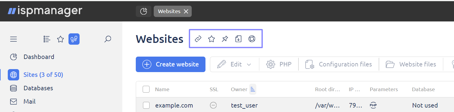
 | Copy the link to clipboard |
 | Add the module to "Favorites" (click "Favorites" on the left-side menu to see a complete list) |
 | Pin the tab in the upper menu |
 | Save data in CSV format |
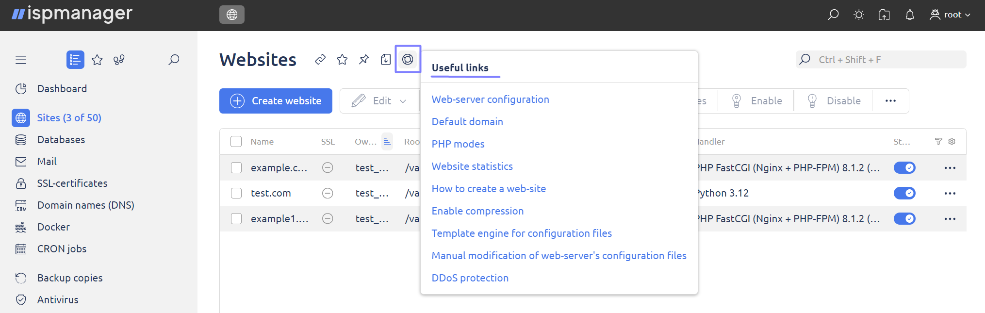
 | Open useful links |
Set filters
With the filter function, you can quickly do a data search in the list.
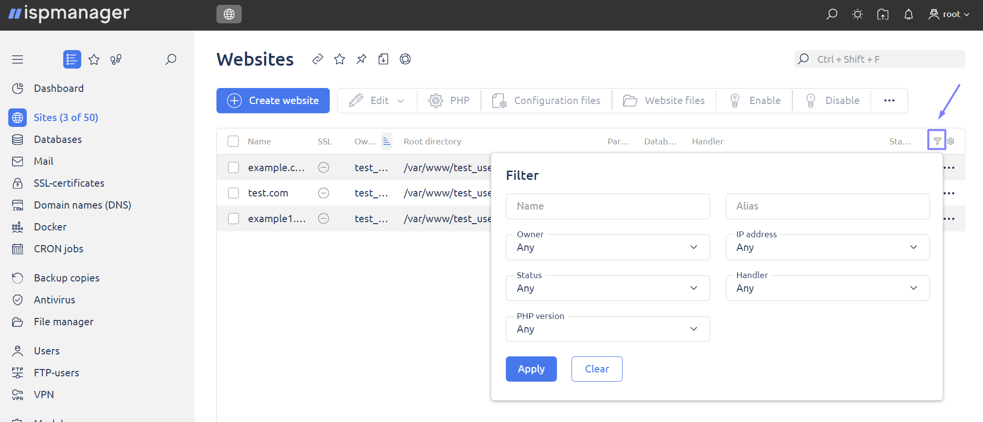
Depending on the section you are in, you may have different search parameters.
- Apply — sort the list by specified parameters;
- Clear — delete all data in the form.
Help
Hints
All fields have hints, which are shown either when putting the mouse cursor on the input field, or when moving the mouse cursor over the hint icon.
To get information about a certain module of the control panel in Documentation, click the "Help" icon .
Useful links
In some sections, you can see links to useful articles where you can find detailed information about setup, configuration, etc.
Keyboard Shortcuts
General
CTRL + SHIFT + M — give focus to the search bar of the main navigation menu
CTRL + ALT + X — close all tabs
CTRL + SHIFT + X — close all tabs but the active one
List elements
CTRL + SHIFT + A — select/unselect all elements in the list
CTRL + SHIFT + F — give focus to the search bar